Markers
Using Mappedin SDK for React Native with your own map requires a Pro license. Try a demo map for free or refer to the Pricing page for more information.
Mappedin SDK for React Native allows adding and removing Mappedin.Marker on a map. Markers are elements containing HTML that Mappedin anchors to any IAnchorable target. They are automatically rotated and repositioned when the camera moves.
Note that the MapViewControl class implements the Markers interface and exposes it as MapViewControl.Markers. Use MapViewControl.Markers to utilize Markers' methods. An instance of MapViewControl is available from the useMap hook.
Creating Markers
A complete example demonstrating markers can be found in the Mappedin React Native GitHub repo: markers.tsx
Markers are added to the map by referencing a target that can be any IAnchorable. The following code sample adds a marker to a coordinate.
- Declarative
- Imperative
// Get all spaces with names
const spaces = mapData.getByType('space').filter(space => space.name);

// Create markers for all spaces with its space name and make them interactive
return (
  <>
    {spaces.map(space => (
      <Marker
        key={space.externalId}
        target={space}
        text={space.name} // marker text
        options={{ interactive: true }}
      />
    ))}
  </>
);
mapView.Markers.add(coordinate, '<div>This is a Marker!</div>');
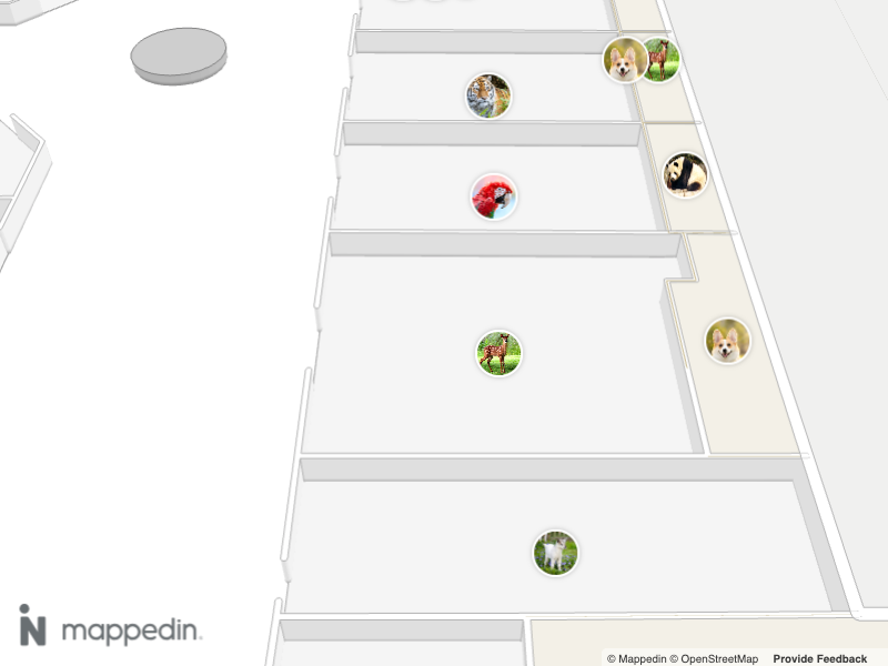
The following image shows a map with markers with images.
Placement
Marker placement is set using the options argument of Markers.add(). Options accepts a TAddMarkerOptions value, which has a member named placement. When provided, the point of the Marker described by the placement is placed next to the target. For example, using center will place the Marker's center at the target. Both a single placement and an array of placements can be provided. When an array is provided, the Marker is placed at the first target that has space available to display the Marker. Placement positions are defined in TMarkerPlacement which contains 9 values. The placement points are as follows, with the default being center.
TMarkerPlacement
centertopleftbottomrighttop-lefttop-rightbottom-leftbottom-right
Marker content can be styled using CSS that references the placement of the marker. This can allow the creation of a tooltip or bubble-style marker that points to its target. This is done by using the CSS Selector:
.mappedin-marker[data-placement='<PLACEMENT>'];
Where <PLACEMENT> is the placement position. Here is an example of adding a triangle pointer to the Marker's target of left:
.marker:before {
	content: '';
	width: 0;
	height: 0;
	top: calc(50% - 10px);
	left: -10px;
	z-index: 1;
	position: absolute;
	border-bottom: 10px solid transparent;
	border-top: 10px solid transparent;
	z-index: -1;
}

.mappedin-marker[data-placement="left"] .marker:before {
	left: auto;
	right: -5px;
	border-left: 10px solid #333333;
}
Removing Markers
Markers can be removed individually by using the Mappedin.Markers.remove(marker) method, passing in the marker to be removed as shown below.
mapView.Markers.remove(marker);
To remove all markers from a map, call Mappedin.Markers.removeAll().
mapView.Markers.removeAll();
Marker Rank
Ranking can be added to markers to control which marker will be shown when more than one marker occupies the same space. The marker with the highest rank will be shown. If markers do not overlap, ranking will have no effect. Rank values low, medium, high and always-visible as defined in Mappedin.TCollisionRankingTier.
The code below adds markers where a user clicks on the map. The marker rank is cycled with each click. If the user clicks and adds multiple markers in the same location, the marker with the highest rank is shown and lower ranking markers are hidden.
- Declarative
- Imperative
const [markers, setMarkers] = useState<{
  coordinate: Mappedin.Coordinate;
  text: string;
  rank: Mappedin.TCollisionRankingTier;
}[]>([]);

// define available ranks and current rank state
const RANKS: Mappedin.TCollisionRankingTier[] = ['medium', 'high', 'always-visible'];
const [currentRank, setCurrentRank] = useState(0);

// handle map clicks to add a marker with a cycling rank
useMapViewEvent('click', (event) => {
  if (!mapView) return;

  // cycle through rank values
  const newRank = (currentRank + 1) % RANKS.length;
  setCurrentRank(newRank);

  // create a new marker with the current rank
  const newMarker = {
    coordinate: event.coordinate,
    text: `Marker Rank ${RANKS[newRank]}`,
    rank: RANKS[newRank],
  };

  // add new marker to state
  setMarkers((prevMarkers) => [...prevMarkers, newMarker]);
});

// render markers using the Marker component
return (
  <>
    {markers.map((marker, index) => (
      // note: <Marker> component generates a .mappedin-marker class
      <Marker
        key={index}
        target={marker.coordinate}
        options={{
          interactive: true,
          rank: marker.rank
        }}
      >
        <div style={{
          borderRadius: '10px',
          backgroundColor: '#fff',
          padding: '5px',
          boxShadow: '0px 0px 1px rgba(0, 0, 0, 0.25)',
          fontFamily: 'sans-serif',
          textAlign: 'center'
        }}>
          <p style={{
            margin: 0,
            fontSize: '14px'
          }}>
            {marker.text}
          </p>
          <p style={{
            margin: 0,
            fontSize: '10px',
            color: '#666'
          }}>
            Rank: {marker.rank}
          </p>
        </div>
      </Marker>
    ))}
  </>
);
const RANKS = ['medium', 'high', 'always-visible'] as const;
let rank = 0 as number;

// Act on the click event and add a marker with a cycling rank. Observe how higher ranking markers are shown when they collide with lower ranking markers.
mapView.on('click', async (event) => {
  // TCollisionRankingTier contains 3 values. If rank exceeds 2, reset it to 0.

  const markerTemplate = `
  <div>
    <style>
    .marker {
      display: flex;
      align-items: center;
      background-color: #fff;
      max-height: 64px;
      border: 2px solid grey;
      padding: 4px 12px;
      font-weight: bold;
      font-family: sans-serif;
    }

    .marker img {
      max-width: 64px;
      max-height: 32px;
      object-fit: contain;
      margin-right: 12px;
    }
    </style>
    <div class="marker">
      <p>Marker Rank: ${RANKS[rank]}</p>
    </div>
  </div>`;

  // Add a marker with the current rank at the clicked coordinate.
  mapView.Markers.add(event.coordinate, markerTemplate, {
    rank: RANKS[rank],
  });
  rank++;
  if (rank === RANKS.length) {
    rank = 0;
  }
});
Moving Markers
Markers can be repositioned after they have been added to a map. using the Markers class to call setPosition or animateTo.
- Mappedin.Markers.setPosition() instantly repositions a Marker
- Mappedin.Markers.animateTo() animates a Marker to a new position
The Marker's position can be set to any IAnchorable target.
The animateTo method takes an options parameter of TAnimationOptions that defines the animation duration and EasingCurve, which can be linear, ease-in, ease-out or ease-in-out.
- Linear: This function implies a constant rate of change. It means the animation proceeds at the same speed from start to end. There's no acceleration or deceleration, giving a very mechanical feel.
- Ease-in: This function causes the animation to start slowly and then speed up as it progresses. Initially, there's gradual acceleration, and as the function moves forward, the rate of change increases.
- Ease-out: Contrary to ease-in, ease-out makes the animation start quickly and then slow down towards the end. It begins with a faster rate of change and gradually decelerates.
- Ease-in-out: This function combines both ease-in and ease-out. The animation starts slowly, speeds up in the middle, and then slows down again towards the end. It offers a balance of acceleration and deceleration.
The code samples below displays a custom Marker when the map is first clicked. When the map is clicked again, the Marker is animated to the clicked location using the default animation options.
- Declarative
- Imperative
export default function AnimatedMarkers() {
  const { mapData } = useMap();
  const [markerCoordinate, setMarkerCoordinate] = useState<Mappedin.Coordinate | null>(
    mapData?.mapCenter || null
  );

  // handle map clicks to update the marker's coordinate
  useMapViewEvent("click", (event) => {
    setMarkerCoordinate(event.coordinate);
  });

  // render <AnimatedMarker/> with updated coordinates
  return (
    <>
      {markerCoordinate && (
        <AnimatedMarker
          target={markerCoordinate}
          duration={1000}
          options={{ interactive: true, anchor: "right" }}
        >
          <img
            src="https://xg3cy9.csb.app/logo.png"
            alt="Marker"
            style={{
              width: "25px",
              position: "relative",
              top: "-10px",
              left: "-13px",
            }}
          />
        </AnimatedMarker>
      )}
    </>
  );
}
let marker;
mapView.on('click', async (event) => {
  if (marker) {
    mapView.Markers.animateTo(marker, event.coordinate);
  } else {
    marker = mapView.Markers.add(
      event.coordinate,
      'Marker',
      {
        interactive: true,
        anchor: 'right'
      }
    );
  }
});
Enabling and Disabling Markers
Markers can be dynamically enabled or disabled using MapViewControl.updateState() or the enabled property of Mappedin.TAddMarkerOptions.enabled. When a marker is disabled, it will be hidden from view but remain in the map's memory. This is useful for managing marker visibility based on conditions like zoom level or user interaction, without the overhead of repeatedly adding and removing markers.
Use MapViewControl.getState() to check a marker's current state, which returns the marker's current properties including its enabled status.
Here's an example on how to enable/disable markers on click:
- Declarative
- Imperative
const [isEnabled, setIsEnabled] = useState(true);
const space = mapData?.getByType("space")[14];

useMapViewEvent("click", (event) => {
  setIsEnabled(!isEnabled);
});

return (
  <Marker
    target={space}
    options={{
      enabled: isEnabled,
      interactive: true
    }}
  >
    <div className="markerContainer">
      Click to enable/disable marker
    </div>
  </Marker>
);
let coordinate;
let marker;
mapView.on("click", async (event) => {
    // first click - add marker
    if (!marker) {
        console.log("Adding marker at:", event.coordinate);
        coordinate = event.coordinate;
        marker = mapView.Markers.add(
            coordinate,
            "<div class='markerContainer'>Enabled Marker!</div>"
        );
    } else {
        // get current state of marker
        const markerState = mapView.getState(marker);
        console.log("Current Marker State:", markerState);

        // toggle enabled state
        const newState = !markerState.enabled;
        mapView.updateState(marker, { enabled: newState });
        console.log(`Marker is now ${newState ? "enabled" : "disabled"}`);
    }
});
A common use case is showing different sets of markers based on zoom level:
- Declarative
- Imperative
const spaces = mapData.getByType('space')
const [secondaryMarkers, setSecondaryMarkers] = useState(
  spaces.slice(5).map(space => ({
    target: space,
    text: space.name,
    enabled: false
  }))
);

useMapViewEvent('camera-change', (transform) => {
  setSecondaryMarkers(markers =>
    markers.map(marker => ({
      ...marker,
      enabled: transform.zoomLevel >= 20
    }))
  );
});

return (
  <>
    {/* primary markers - always visible */}
    {spaces.slice(0, 5).map(space => (
      <Marker
        key={space.id}
        target={space}
        text={space.name}
        options={{ enabled: true }}
      />
    ))}

    {/* secondary markers - conditionally visible */}
    {secondaryMarkers.map(marker => (
      <Marker
        key={marker.target.id}
        target={marker.target}
        text={marker.text}
        options={{ enabled: marker.enabled }}
      />
    ))}
  </>
);
// create two sets of markers from spaces
const primaryMarkers = mapData
  .getByType("space")
  .filter((space) => space.name !== "")
  .slice(0, 40)
  .map((space) =>
    mapView.Markers.add(
      space,
      `<div class="markerContainer">Primary: ${space.name}</div>`,
      { interactive: true, enabled: true }
    )
  );

// add & store secondary markers with references
const secondaryMarkers = mapData
  .getByType("space")
  .filter((space) => space.name !== "")
  .slice(40, 60)
  .map(async (space) => {
    const marker = await mapView.Markers.add(
      space,
      `<div class="markerContainer markerSecondary">Secondary: ${space.name}</div>`,
      { interactive: true }
    );
    marker.markerInstance = markerObject; // store reference
    mapView.updateState(marker, { enabled: false }); // init hide secondary markers
  });

// update marker visibility based on zoom level
mapView.on("camera-change", (transform) => {
  if (transform.zoomLevel < 19) {
    secondaryMarkers.forEach((marker) => {
      if (marker.markerInstance) {
        mapView.updateState(marker.markerInstance, { enabled: false });
      }
    });
  } else {
    secondaryMarkers.forEach((marker) => {
      mapView.updateState(marker.markerInstance, { enabled: true });
    });
  }
});
A complete example demonstrating markers can be found in the Mappedin React Native GitHub repo: markers.tsx