Labels
Using Mappedin SDK for React Native with your own map requires a Pro license. Try a demo map for free or refer to the Pricing page for more information.
Labels display text and images anchored to specific points on a map. They rotate, show, or hide based on priority and zoom level, providing information about location names, points of interest, and more. Effective labels help apps convey additional information, such as room names, points of interest, main entrances, or other useful contextual details.
Note that the MapViewControl class implements the Mappedin.Labels interface and exposes it as MapViewControl.Labels. Use MapViewControl.Labels to utilize Labels' methods. An instance of MapViewControl is available from the useMap hook.
A complete example demonstrating labels can be found in the Mappedin React Native GitHub repo: labels.tsx
Displaying All Labels
To display all labels that have been added to the source map, use the Mappedin.Labels.all(). The following code sample demonstrates use of the all() method:
- Declarative
- Imperative
// Get all spaces with names
const spaces = mapData.getByType('space').filter(space => space.name);

// Add labels for all spaces
return (
  <>
    {spaces.map(space => (
      <Label
        key={space.externalId}
        target={space}
        text={space.name}
      />
    ))}
  </>
);
// Add all the labels to the map.
mapView.Labels.all();
The opposite of the all() method is the Mappedin.Labels.removeAll() method, which removes all labels from the map.
// Remove all the labels from the map.
mapView.Labels.removeAll();
Adding & Removing Individual Labels
Labels can be added individually to a map by calling Mappedin.Labels.add(). A label can be added to any Mappedin.IAnchorable target. The following code sample adds a label to each space that has a name:
- Declarative
- Imperative
// Get all spaces with names
const spaces = mapData.getByType('space').filter(space => space.name);

// Label all spaces with its space name and make them interactive.
return (
  <>
    {spaces.map(space => (
      <Label
      key={space.externalId}
        target={space}
        text={space.name} // label text
        options={{ interactive: true }} // makes the label interactive
      />
    ))}
  </>
);
// Label all spaces with its space name and make them interactive.
mapData.getByType('space').forEach((space) => {
  if (space.name) {
    mapView.Labels.add(space, space.name, { interactive: true });
  }
});
Labels can be removed by using the Mappedin.Labels.remove(label) method, passing in the label to be removed as shown below:
// Remove a label.
mapView.Labels.remove(label);
Interactive Labels
Labels added to the map can be set to interactive to allow users to click on them. For more information, refer to the Interactive Labels section of the Interactivity Guide.
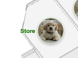
Label Icons
Icons can be added to labels in SVG, PNG, JPEG and WebP formats. Icons are clipped in a circle to prevent overflow. Three clipping methods of contain, fill and cover can be set in the Mappedin.LabelAppearance.iconFit parameter with contain being the default.
| Fill | Contain | Cover (default) |
|---|---|---|
 | 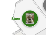 | 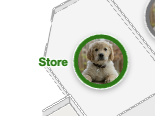 |
The Mappedin.LabelAppearance.iconPadding property sets the amount of space between the icon and the border. The icon may shrink based on this value.
padding: 0 | padding: 10 |
|---|---|
 | 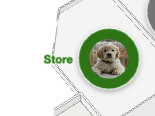 |
Label icons can be configured to be shown or hidden based on the current zoom level using Mappedin.LabelAppearance.iconVisibleAtZoomLevel. This defines the zoom level at which the icon becomes visible. Infinity ensures never visible, -Infinity ensures always visible.
Label Appearance
Labels can have their appearance styled to match the visual theme of an app or to make groups of labels easily distinguishable from one another. The following type declaration of LabelAppearance describes these customisable attributes.
| Option | Type | Description | Default |
|---|---|---|---|
margin | number | Margin around the label text and pin in pixels. This will affect label density. Minimum is 6px. | 6 |
maxLines | number | Number of lines to display when text spans multiple lines. | 2 |
textSize | number | Text size in pixels | 11.5 |
maxWidth | number | Maximum width of text in pixels. | 150 |
lineHeight | number | Line height sets the height of a line box. It's commonly used to set the distance between lines of text. | 1.2 |
color | ColorString | A ColorString for the label text and pin. | #333 |
outlineColor | ColorString | A ColorString for the outline around the label text and pin. | white |
textColor | ColorString | A ColorString representing just the text color. Defaults to the same as color. | - |
textOutlineColor | ColorString | A ColorString representing just the text outline. Defaults to the same as outlineColor. | - |
pinColor | ColorString | A ColorString representing just the pin color. Defaults to the same as color. | - |
pinOutlineColor | ColorString | A ColorString representing just the pin outline. Defaults to the same as outlineColor. | - |
pinColorInactive | ColorString | A ColorString representing just the pin color when the label is inactive. Defaults to the same as pinColor. | - |
pinOutlineColorInactive | ColorString | A ColorString representing just the pin outline when the label is inactive. Defaults to the same as pinOutlineColor. | - |
icon | string | An icon to be placed inside the label pin. Can be an SVG string or a path to a PNG or JPEG. | - |
iconSize | number | Size of the icon in pixels. Requires icon to be set. | 20 |
iconScale | number | Interpolation | Scale the icon uniformly. Specify a number or an Interpolation object. | 1 |
iconPadding | number | Padding between the icon and the marker's border in pixels. | 2 |
iconFit | 'fill' | 'contain' | 'cover' | How the icon should fit inside the marker. Options: fill (stretch to fill), cover (maintain aspect ratio and fill), contain (maintain aspect ratio and fit inside). | cover |
iconOverflow | 'visible' | 'hidden' | Whether the icon should overflow the circle of the marker. Options: visible, hidden. | hidden |
iconVisibleAtZoomLevel | number | Defines the zoom level at which the icon becomes visible. Infinity ensures never visible, -Infinity ensures always visible. | -Infinity |
The code sample below demonstrates how to use some label styling options. It specifies an SVG icon to use and sets the icon and text color. Labels are added to each space with a name.
// SVG image for the label's icon.
const icon = `<svg width="92" height="92" viewBox="-17 0 92 92" fill="none" xmlns="http://www.w3.org/2000/svg">

<g clip-path="url(#clip0)">
<path d="M53.99 28.0973H44.3274C41.8873 28.0973 40.7161 29.1789 40.7161 31.5387V61.1837L21.0491 30.7029C19.6827 28.5889 18.8042 28.1956 16.0714 28.0973H6.5551C4.01742 28.0973 2.84619 29.1789 2.84619 31.5387V87.8299C2.84619 90.1897 4.01742 91.2712 6.5551 91.2712H16.2178C18.7554 91.2712 19.9267 90.1897 19.9267 87.8299V58.3323L39.6912 88.6656C41.1553 90.878 41.9361 91.2712 44.669 91.2712H54.0388C56.5765 91.2712 57.7477 90.1897 57.7477 87.8299V31.5387C57.6501 29.1789 56.4789 28.0973 53.99 28.0973Z" fill="white"/>
<path d="M11.3863 21.7061C17.2618 21.7061 22.025 16.9078 22.025 10.9887C22.025 5.06961 17.2618 0.27124 11.3863 0.27124C5.51067 0.27124 0.747559 5.06961 0.747559 10.9887C0.747559 16.9078 5.51067 21.7061 11.3863 21.7061Z" fill="white"/>
</g>
<defs>
<clipPath id="clip0">
<rect width="57" height="91" fill="white" transform="translate(0.747559 0.27124)"/>
</clipPath>
</defs>
</svg>`;

  // Define colors for labels
const colors = ['blue', 'pink', 'green', 'orange', 'tomato', 'gray'];

// Get all spaces with names
const spaces = mapData.getByType('space').filter(space => space.name);

return (
    <>
        {spaces.map((space, index) => {
            const color = colors[index % colors.length]; // Cycle through colors
            const icon = `<svg width="24" height="24" xmlns="http://www.w3.org/2000/svg"><circle cx="12" cy="12" r="10" fill="${color}" /></svg>`;

            return (
                <Label
                    key={space.externalId}
                    target={space}
                    text={space.name} // Label text
                    options={{
                        appearance: {
                          color: color,
                          icon: icon, // Custom SVG icon
                        },
                        interactive: true, // Make the label interactive
                    }}
                />
            );
        })}
    </>
);
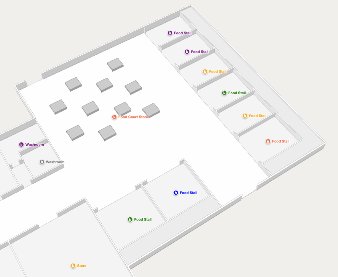
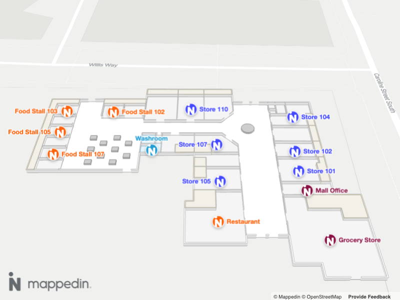
Showing a map with labels with custom styling and icons.
Label Ranking
Ranking can be added to labels to control which label will be shown when more than one label occupies the same space. The label with the highest rank will be shown. If labels do not overlap, ranking will have no effect. Rank values are low, medium, high, and always-visible and are defined in Mappedin.TCollisionRankingTier.
The code below adds labels where a user clicks on the map. The label rank is cycled with each click. If the user clicks and adds multiple labels in the same location, the label with the highest rank is shown and lower ranking labels are hidden.
- Declarative
- Imperative
const [labels, setLabels] = useState<
    {
        coordinate: Mappedin.Coordinate;
        text: string;
        rank: Mappedin.TCollisionRankingTier;
    }[]
>([]);

const RANKS: Mappedin.TCollisionRankingTier[] = ['low', 'medium', 'high', 'always-visible'];
const [currentRank, setCurrentRank] = useState(0);

// Handle map clicks to add a label with a cycling rank
useMapViewEvent('click', event => {
    const newRank = (currentRank + 1) % RANKS.length; // Cycle through ranks
    setCurrentRank(newRank);

    const newLabel = {
        coordinate: event.coordinate,
        text: `Label Rank ${RANKS[newRank]}`,
        rank: RANKS[newRank],
    };

    setLabels(prevLabels => [...prevLabels, newLabel]);
});

return (
    <>
        {labels.map((label, index) => (
            <Label
                key={index} // Use index as a fallback key for simplicity
                target={label.coordinate} // Add the label to the clicked coordinate
                text={label.text}
                options={{
                    rank: label.rank, // Set the rank for the label
                }}
            />
        ))}
    </>
);
const RANKS: TCollisionRankingTier[] = ['low', 'medium', 'high', 'always-visible'];
let currentRank = 0;

// Act on the click event and add a label with a cycling rank. Observe how higher ranking labels are shown when they collide with lower ranking labels.
mapView.on('click', async (event) => {
    currentRank++;
    // There are 4 possible ranks. If rank exceeds 3, reset it to 0.
    if (currentRank > 3) {
        currentRank = 0;
    }

    // Add a label with the current rank at the clicked coordinate.
    mapView.Labels.add(event.coordinate, 'Label Rank ' + RANKS[currentRank], {
        rank: RANKS[currentRank],
    });
});
Enabling and Disabling Labels
Labels can be dynamically enabled or disabled using MapViewControl.updateState() or the Mappedin.TAddLabelOptions.enabled. When a label is disabled, it will be hidden from view but remain in the map's memory. This is useful for managing label visibility based on conditions like zoom level or user interaction, without the overhead of repeatedly adding and removing labels.
Use MapViewControl.getState() to check a label's current state, which returns the label's current properties including its enabled status.
Here's an example on how to enable/disable labels on click:
- Declarative
- Imperative
const [isEnabled, setIsEnabled] = useState(false);

return (
  <Label
    target={space}
    text="Dynamic Label"
    options={{
      enabled: isEnabled // label will be hidden when false
    }}
  />
);
let coordinate;
let label;
mapView.on("click", async (event) => {
    // first click - add label
    if (!label) {
        console.log("Adding label at:", event.coordinate);
        coordinate = event.coordinate;
        label = await mapView.Labels.add(
            coordinate,
            "Click to Toggle!",
            {
                interactive: true,
                enabled: true
            }
        );
    } else {
        // get current state of label
        const labelState = mapView.getState(label);
        console.log("Current Label State:", labelState);

        // toggle enabled state
        const newState = !labelState.enabled;
        mapView.updateState(label, { enabled: newState });
        console.log(`Label is now ${newState ? "enabled" : "disabled"}`);
    }
});
A common use case is showing different sets of labels based on zoom level:
- Declarative
- Imperative
const [secondaryLabels, setSecondaryLabels] = useState(
  spaces.slice(5).map(space => ({
    target: space,
    text: space.name,
    enabled: false
  }))
);

useMapViewEvent('camera-change', (transform) => {
  setSecondaryLabels(labels =>
    labels.map(label => ({
      ...label,
      enabled: transform.zoomLevel >= 20
    }))
  );
});

return (
  <>
    {/* primary labels - always visible */}
    {spaces.slice(0, 5).map(space => (
      <Label
        key={space.id}
        target={space}
        text={space.name}
        options={{ enabled: true }}
      />
    ))}

    {/* secondary labels - conditionally visible */}
    {secondaryLabels.map(label => (
      <Label
        key={label.target.id}
        target={label.target}
        text={label.text}
        options={{ enabled: label.enabled }}
      />
    ))}
  </>
);
// init secondary labels - hidden until zoomed in
secondaryLabels = mapData
  .getByType("space")
  .filter((space) => space.name !== "")
  .slice(40, 60)
  .map((space) => ({
    target: space,
    text: "Secondary: " + space.name,
    options: { interactive: true, enabled: true },
    labelInstance: undefined,
  }));

// add secondary labels, then immediately disable them
secondaryLabels.forEach(async (label) => {
  label.labelInstance = await mapView.Labels.add(
    label.target,
    label.text,
    label.options
  );

  // store ref and disable initially
  mapView.updateState(label.labelInstance, { enabled: false });
});

// handle camera change to toggle secondary labels
mapView.on("camera-change", (transform) => {
  if (transform.zoomLevel < 19) {
    secondaryLabels.forEach((label) => {
      if (label.labelInstance) {
        mapView.updateState(label.labelInstance, { enabled: false });
      }
    });
  } else {
    secondaryLabels.forEach((label) => {
      if (label.labelInstance) {
        mapView.updateState(label.labelInstance, { enabled: true });
      }
    });
  }
});
A complete example demonstrating labels can be found in the Mappedin React Native GitHub repo: labels.tsx
Flat Labels with Text3D
Text3D creates three-dimensional text labels that are rendered directly on the map. These labels are perfect for displaying space names, room numbers, or any text that needs to be visible from any angle in the 3D environment. Text3D labels are added to the map using a Coordinate using the Text3D.add() method.
The look of these labels can be customized using TAddText3DAnchorableOptions, which supports custom font size, color, outline width and color as well as stroke width and color.
const randomOptions: TAddText3DAnchorableOptions = {
  rotation: 180,
  appearance: {
    fontSize: 2.0,
    color: "#ffa500",
    outlineWidth: 0.7,
    outlineColor: "#000000",
    strokeWidth: 0.05,
    strokeColor: "#00ffff",
  },
};

mapView.Text3D.add(e.coordinate, "Hello, world!", randomOptions);