Floating Labels
Using Mappedin SDK for React Native with your own map requires an Enterprise license. Try a demo map for free or refer to the Pricing page for more information.
In the release of Mappedin SDK for React Native v5, Flat Labels and Floating Labels have been separated into their own objects under the
MapViewStore.labelAllLocations()has been deprecated andlabelPolygon()has been removed.
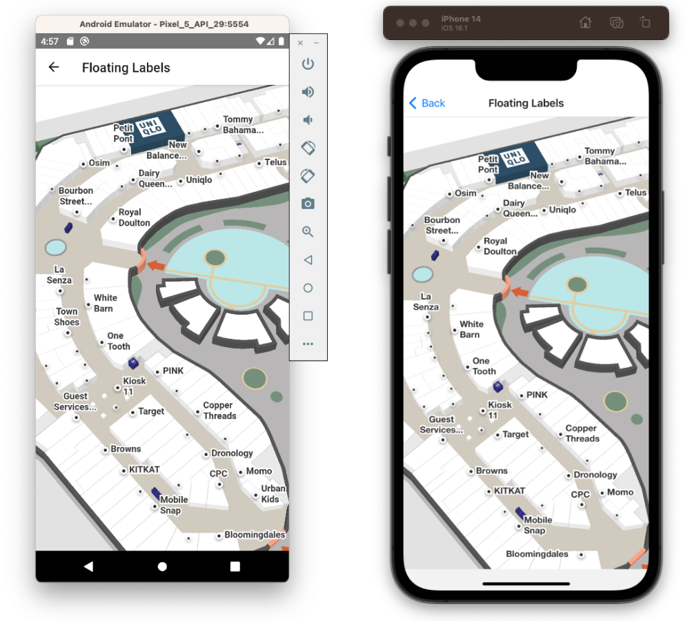
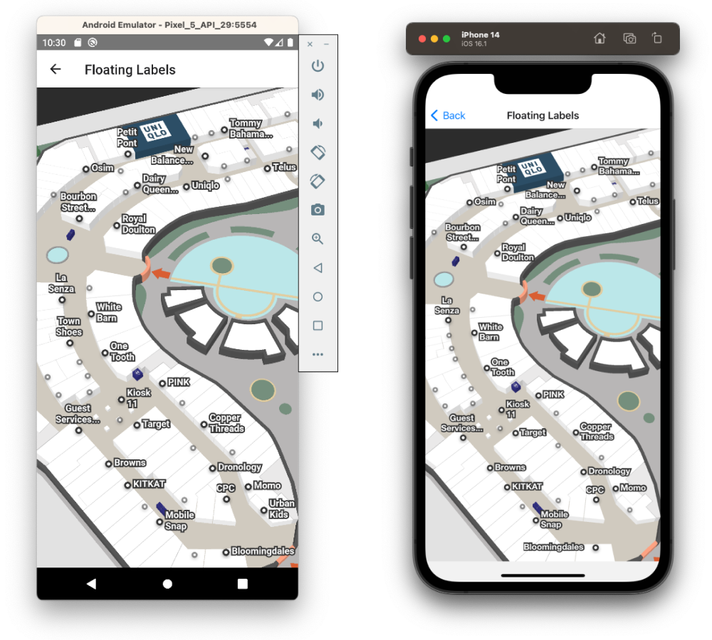
The Mappedin SDK for React Native automatically labels all locations with Floating Labels by default. These labels hover above a node and handle repositioning and rotation to face the camera at all times.

Customizing Appearance
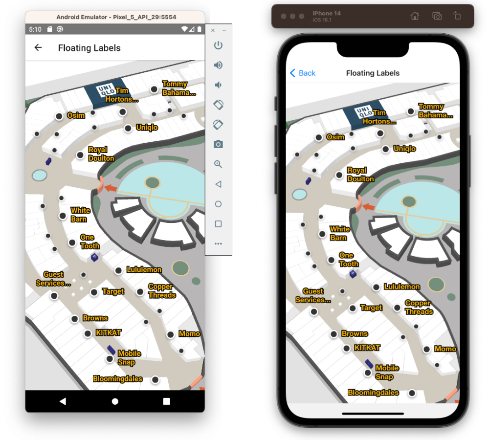
Floating Labels can be customized if they are created after the MapView initialization. We can do this by first setting labelAllLocationsOnInit: false in the MiMapView options prop.
options={{
  venue: "<VENUE_SLUG>",
  clientId: "<MAPPEDIN_CLIENT_ID>",
  clientSecret: "<MAPPEDIN_CLIENT_SECRET>",
  labelAllLocationsOnInit: false,
}}
Then, in the onFirstMapLoaded callback we create the labels and supply our appearance object with text size and background and foreground colors. This customization will apply to all labels.
onFirstMapLoaded={() => {
  mapView.current?.FloatingLabels.labelAllLocations({
    appearance: {
      marker: {
        size: 16,
      },
      text: {
        size: 16,
        foregroundColor: '#ffb702',
        backgroundColor: '#0a0a0a',
      },
    },
  });
}}

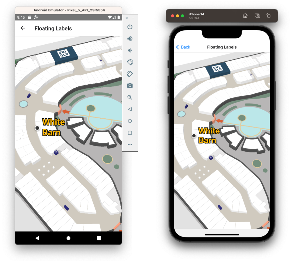
Taking this a step further, we could instead customize only the label of a touched polygon. To do this, use the onClick callback and FloatingLabels.add to pass the appearance object to a single label. When the user touches outside of the polygons, we remove and re-label all locations with default appearance.
onClick={({polygons}) => {
  if (polygons.length > 0) {
    mapView.current?.FloatingLabels.removeAll();
    mapView.current?.FloatingLabels.add(
      polygons[0],
      polygons[0].locations[0].name,
      {
        appearance: {
          marker: {
            size: 16,
          },
          text: {
            size: 32,
            foregroundColor: '#ffb702',
            backgroundColor: '#0a0a0a',
          },
        },
      },
    );
  } else {
    mapView.current?.FloatingLabels.removeAll();
    mapView.current?.FloatingLabels.labelAllLocations();
  }
}}

The documentation for TFloatingLabelAppearance explains all the customization options such as colors and sizes for the marker and the text.
export type TFloatingLabelAppearance = {
	/** Margin around the label and marker. This will affect label density */
	margin?: number;
	/** Text styling options */
	text?: {
		/** Number of lines to display when text spans multiple lines */
		numLines?: number;
		/** Text size in pixels */
		size?: number;
		/** Maxiumum width of text in pixels */
		maxWidth?: number;
		/** Line height sets the height of a line box. @default 1.2 */
		lineHeight?: number;
		foregroundColor?: string;
		backgroundColor?: string;
	};
	/** Floating Label marker styling options */
	marker?: {
		/** Size of the marker in pixels */
		size?: number;
		/** Foreground color settings when the markers is active and inactive (outranking markers are shown) */
		foregroundColor?: {
			active?: string;
			inactive?: string;
		};
		/** Background color settings when the markers is active and inactive (outranking markers are shown) */
		backgroundColor?: {
			active?: string;
			inactive?: string;
		};
	};
};
Adding Icons
Icons can be added to Floating Labels to highlight certain categories or make a location more eye catching. These icons automatically adjust, becoming visible as the user zooms the map to view more detail. The supplied icon must be an SVG provided to the TFloatingLabelAppearance options in FloatingLabels.add().
For this demonstration, we'll use only a single icon defined below. For best results, a square icon with low detail is preferable. We've also defined some colors which we'll use to differentiate between location categories.
const icon = `<svg width="92" height="92" viewBox="-17 0 92 92" fill="none" xmlns="http://www.w3.org/2000/svg">
            <g clip-path="url(#clip0)">
            <path d="M53.99 28.0973H44.3274C41.8873 28.0973 40.7161 29.1789 40.7161 31.5387V61.1837L21.0491 30.7029C19.6827 28.5889 18.8042 28.1956 16.0714 28.0973H6.5551C4.01742 28.0973 2.84619 29.1789 2.84619 31.5387V87.8299C2.84619 90.1897 4.01742 91.2712 6.5551 91.2712H16.2178C18.7554 91.2712 19.9267 90.1897 19.9267 87.8299V58.3323L39.6912 88.6656C41.1553 90.878 41.9361 91.2712 44.669 91.2712H54.0388C56.5765 91.2712 57.7477 90.1897 57.7477 87.8299V31.5387C57.6501 29.1789 56.4789 28.0973 53.99 28.0973Z" fill="white"/>
            <path d="M11.3863 21.7061C17.2618 21.7061 22.025 16.9078 22.025 10.9887C22.025 5.06961 17.2618 0.27124 11.3863 0.27124C5.51067 0.27124 0.747559 5.06961 0.747559 10.9887C0.747559 16.9078 5.51067 21.7061 11.3863 21.7061Z" fill="white"/>
            </g>
            <defs>
            <clipPath id="clip0">
            <rect width="57" height="91" fill="white" transform="translate(0.747559 0.27124)"/>
            </clipPath>
            </defs>
            </svg>`;

const colors = ['dodgerblue', 'pink', 'green', 'orange', 'tomato', 'gray'];
We can use the list in the MapViewStore.VenueData Mappedin class to iterate through locations and add their icons. At the same time, we'll apply color to the Floating Label's marker.
onFirstMapLoaded={() => {
  mapView.current?.venueData.categories.forEach(
    (category: MappedinCategory, index: number) => {
      category.locations.forEach((location: MappedinLocation) => {
        if (location.polygons.length <= 0) {
          return;
        }
        const color = colors[index % colors.length];
        mapView.current?.FloatingLabels.add(
          location.polygons[0],
          location.name,
          {
            appearance: {
              marker: {
                icon: icon,
                foregroundColor: {
                  active: color,
                  inactive: color,
                },
              },
            },
          },
        );
      });
    },
  );
}}
The combination of color and icons creates a very attractive appearance for the labels which stands out on the map.
![]()
If you only wish to highlight a few locations using icons and apply a default appearance to the rest, this can be done by applying FloatingLabels.labelAllLocations() before overriding with FloatingLabels.add() as above.
Preset Themes
Mappedin SDK for React Native comes with two preset Floating Label themes:
labelThemes.darkOnLight(default)labelThemes.lightOnDark
Use the light on dark labels labels by importing them and setting the appearance when labeling locations.
import { labelThemes } from '@mappedin/react-native-sdk';

mapView.FloatingLabels.labelAllLocations({
	appearance: labelThemes.lightOnDark,
});
This theme provides a solid starting point for a darker visual style.
