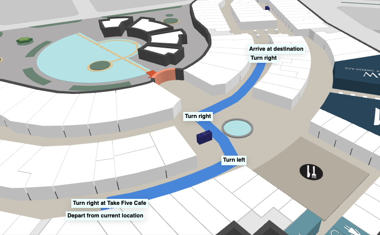
A Tooltip is similar to a marker, except, it has a mechanism to avoid collisions with other items on the map by positioning itself relative to the point where it's added. This is done automatically and makes it useful for long text with icons. Tooltips can also be clickable, which makes them ideal for showing connection points such as elevators and switching to the following map after an interaction from the user.
Tooltips could be used as helpful hints for a user to navigate, with prompts such as "Take elevator to Floor 2" at a certain node on the map.
Drawing Tooltips
When creating a Tooltip, the app specifies some HTML to display and the node to attach it too. The tooltip will be anchored to a specified node or coordinate in one of eight anchor orientations. The possible anchor types are top, bottom, left, right, topLeft, topRight, bottomLeft, and bottomRight. This describes the position of the tooltip relative to the node or coordinate to which it is attached.
To create a simple tooltip:
mapView.createTooltip(instruction.node, `<span style="background-color: azure; padding:0.2rem; font-size:0.7rem">${instruction.instruction}</span>`);Custom Tooltips
While regular Tooltips come with some base styling, custom tooltips allow an app to have complete control over the element's appearance. Creation is similar to a regular tooltip, with the addition of a CSS selector string that allows the SDK to target the tooltip.
Creation of a custom tooltip:
mapView.createCustomTooltip( location.nodes[0], `<div class="my-tooltip-wrapper" style="position: absolute;"> <div class="tips" style="filter: drop-shadow(0 0 2px #00000050);"> <div style="background: red; color: white;padding: 10px;border-radius: 10px;" > Tool Tip </div> </div> </div>`, ".my-tooltip-wrapper", { collisionRank: COLLISION_RANKING_TIERS.ALWAYS_VISIBLE, defaultAnchorType: "right", enabledAnchorTypes: ENABLED_ANCHORS });