Mappedin Web
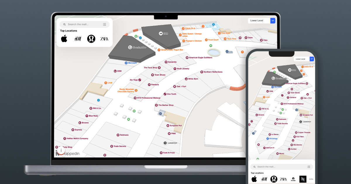
The following guide will walk you through how to integrate Mappedin's Responsive Web App with your website.
Read more about Mappedin Web at https://www.mappedin.com/wayfinding/web-app/
Mappedin Web is a fully packaged solution that can be easily embedded into a website to provide ongoing access to the Mappedin Web platform. It will be automatically updated as Mappedin Web evolves and improves with new features and data driven learnings. Customers using Mappedin Web will always have the best version of our product, with out of the box features including:
- An interactive 3D map
- Location search and category listing
- Turn by turn directions
- A details page for each location including deals, photo gallery, external links, and related locations
- A mobile first, app centric, responsive design
- Deep linking support
... and more.
Prerequisites
Before embedding Mappedin Web, please ensure the following requirements have been met
- Venue is fully mapped and tested (demo links will be provided to preview the front-end experience)
- Location data is up to date and ready for production
- Mappedin venue keys have been provided to you
1. Integration
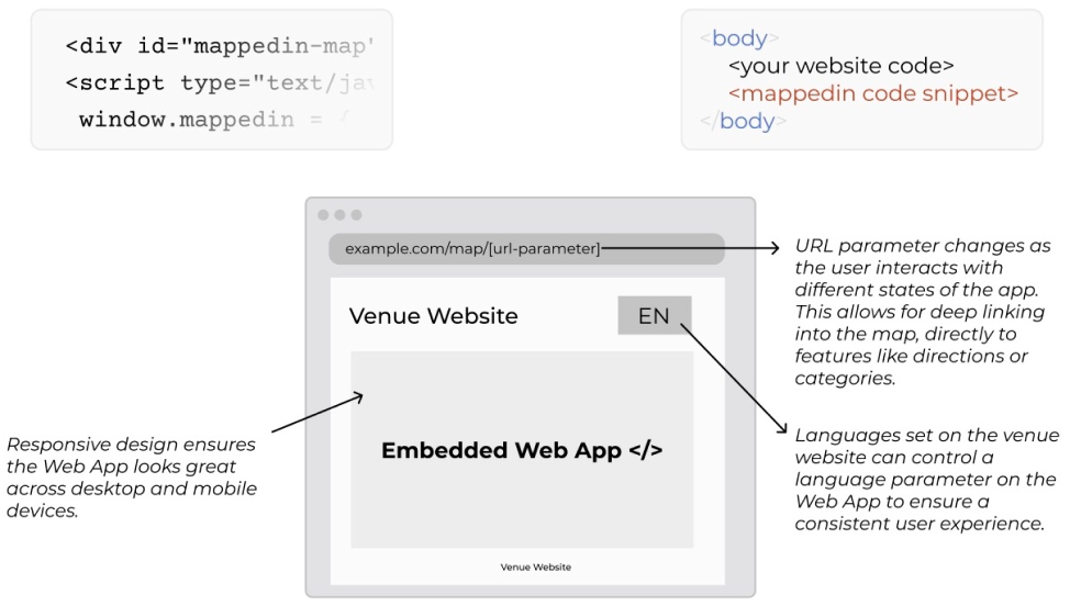
Mappedin will provide credentials and specific instructions, but at a high level you just need a HTML element, Javascript configuration, and an external stylesheet.
Place the following external stylesheet in your <head>:
<link href="https://cdn.mappedin.com/web2/release/mappedin-web.css" rel="stylesheet" />
and include the following JavaScript snippet in the <body>:
<div data-key="externalId" id="mappedin-map"></div>

<script type="text/javascript">
	window.mappedin = {
		miKey: {
			id: '<your credentials>',
			key: '<your credentials>',
		},
		venue: '<your venue here>',
	};
</script>

<script id="mappedin-web" type="module" src="https://cdn.mappedin.com/web2/release/mappedin-web.js"></script>
The map expands to the maximum allowed size based on the parent div of the #mappedin-map element. Positioning and sizing that element for desktop and mobile, will ensure that the map is displayed correctly.
You can also specifiy the source of the data that is loaded onto Mappedin Web. There is a separate draft environment on the Mappedin CMS, where users can make changes, updates or conduct testing without affecting live production data. By default, production data is always loaded, however, you can point the app to load draft data by setting, the optional property, window.mappedin.useDraftData = true in the previous snippet.
<script type="text/javascript">
	window.mappedin = {
		// other values from before
		useDraftData: true,
	};
</script>
We also support specifying links for your privacy policy, terms of use, cookie policy and cookie settings if you'd like to configure them. These are always visible on the app. You can specify them either as strings, or you can specify a callback that will be called when the link is clicked. To set these up, you can use the following properties:
<script type="text/javascript">
	window.mappedin = {
		// other values from before
		legal: {
			termsOfUse: 'https://info.mappedin.com/privacy-policy',
			privacyPolicy: () => alert('Privacy policy callback'),
			cookiePolicy: 'https://example.com',
			cookieSettings: () => {
				console.log('Cookie settings callback function can do whatever you want');
			},
		},
	};
</script>
These are all optional properties. As long as one is specified, the appropriate link(s) will be displayed.
2. Language
To set the language for Mappedin Web, specify the language via the language property in the JavaScript configuration object. Whatever is set in window.mappedin will be the language set on initial load - if no language is set it will default to the user's browser setting or English.
To change the language using JavaScript modify the window.mappedin.language like this: window.mappedin.language = "fr". This configuration needs to be set before the Mappedin script loads.
To change the language during runtime after the map is displayed, use the lang URL parameter like this: ?lang=<languagecode>.
Mappedin Web supports the languages listed below. UI elements that come from Mappedin Web will be shown using the chosen language, however store names, descriptions and other custom data added to the map may be shown in the map's default language if those elements have not been added to the map in the chosen language.
- English (en)
- Arabic (ar)
- Catalan (ca)
- Chinese (zh)
- Croatian (hr)
- Czech (cs)
- Danish (da)
- Dutch (nl)
- English (UK) (en-GB)
- English (US) (en-US)
- Estonian (et)
- Finnish (fi)
- French (fr)
- French (France) (fr-FR)
- French (Canada) (fr-CA)
- German (de)
- Greek (el)
- Hindi (hi)
- Hungarian (hu)
- Italian (it)
- Japanese (ja)
- Korean (ko)
- Maori (mi)
- Malay (ms)
- Norwegian (no)
- Polish (pl)
- Portuguese (pt)
- Romanian (ro)
- Russian (ru)
- Slovak (sk)
- Slovenian (sl)
- Spanish (es)
- Spanish - US (es-US)
- Swedish (Finland) (sv-FI)
- Tagalog (tl)
- Thai (th)
- Turkish (tr)
- Ukrainian (uk)
- Vietnamese (vi)
As we continuously improve these translations, we welcome your feedback during your integration review process.
3. Requirements
It is embedded as a web component not an iFrame. It utilizes the shadow dom to hold the necessary HTML, meaning it can co-exist with the rest of your site but not be affected by your CSS styling. To ensure the best experience across mobile and desktop, it will work best if your site is already designed to be responsive. On desktop, Mappedin Web can have the rest of your site surrounding it, though we recommend you let the map take up as much space as possible (up to nearly a full screen map experience if you want). On mobile, Mappedin Web will fill the screen and provide its own toolbar on the bottom for a scroll-free, app centric experience.
There are some specific details for integration that should be taken into account:
- Wrap Mappedin Web in its own container. This container should be styled to take up the whole screen on mobile (
<1024) and fit into your responsive layout on desktop views. - On desktop, the minimum width of the container should be 1024px
- On mobile, do not include any more page content than the header and the map; things like footers and other content should be excluded or hidden.
- If the host site utilizes hash navigation, Mappedin Web must live on a static page to not interfere.
4. Recommendations
These are not required, but to get the best possible experience there are a few extra steps that can be taken:
- Allow the map to take up as much space as possible on mobile and desktop
- On mobile, avoid adding too many elements that will decrease the vertical space available for Mappedin Web (this is especially noticeable on smaller devices like the iPhone SE
- Use a one column layout
- Use a traditional responsive style (CSS media queries, not JavaScript)
- A page can specify
data-key="externalId"on the Mappedin<div>to have external Ids used in the URL instead of internal Ids. The div would look similar to:<div data-key="externalId" id="mappedin-map"></div>. - Avoid including unnecessary functionality on the map page that could impact load times of Mappedin Web
You can view how an integration should look via the demo page provided for your venue(s). We recommend the integration follow the demo experience.
5. Deep Linking
Mappedin Web offers a way to link directly to many pages. The following represents all of the deep linking routes that are possible, with a description of what it will do and any parameters you will need. You can see these in action by simply using the map and watching the URL. You can then copy and use those URLs directly, or use the list below to make your own.
The URL will display the value type set with data-key in the snippet. All of the values given in the URL need to be URL encoded e.g. space in a name should become %20.
5.1 Location Page
/profile?location=<locationId | locationName | externalId>&my-section=true
locationId: Mappedin ID of the location to displaylocationName: Name of the location to displayexternalId: External ID of the location to displaymy-section: Optional parameter that sets this location as the user's section. Only applicable to stadiums.
Using any of the above will deep link to a specific location.
5.2 Categories Page
/categories
List all available categories
5.3 Specific Category Page
/categories?category=<categoryName | categoryId | externalId>
categoryName: Name of the category to displaycategoryId: Mappedin internal id of the category to displayexternalId: External ID of the category
Display a category page using one of the above identifiers. Defaults to show the name of the category in the URL.
5.4 Search Page
/search
Display the search form
5.5 Directions Page
/directions
Directions page
5.6 Directions - From Page
/directions?from=<fromId | fromName | fromExternalId | fromPolygonId | fromNodeId>
fromId,fromName,fromExternalId,fromPolygonId,fromNodeId: Preset departure point to display directions page with a preset from field
5.7 Directions - To Page
/directions?to=<toId | toName | toExternalId | toPolygonId | toNodeId>
toId,toName,toExternal,toPolygonId,toNodeId: Preset arrival point to display directions page with a preset to field
5.8 Directions - From/To Page
/directions?to=<to>&from=<from>&accessible=true&textDirectionsVisible=true
from: (Location ID, Name, External ID Polygon ID or Node ID) Preset departure pointto: (Location ID, Name, External ID, Polygon ID or Node ID) Preset destination point
Optional:
accessible: Default:false, can set this param to true to enable directions that will prioritize elevators and rampstextDirectionsVisible: Default:false, can set this param to true to show text directions alongside the wayfinding path upon initial load
5.9 Language
?lang=<languageCode>
languageCodeA language code of a supported language.
This can be used to change the language of the map before or after it has been displayed.
Full-page integration example
This example shows how to integrate Mappedin Web as a standalone page instead of inserting it in an existing page with other content.
Frequently Asked Questions
Which browsers are supported?
Mappedin Web supports the recent versions of the major web browsers listed below. Some older version may work, however they are not supported.
- Chrome
- Edge
- Firefox
- Safari
- No IE support
I have followed the above guide, including the styles and the snippet but the map is not visible
This can often be caused by a parent <div> not having a height. The map fills the height and width available to it, so please make sure that any wrapper or parent divs have an adequate height set. To see if this is the issue, modify the parent div in the browser's developer tools to have the following attributes:
position: relative;
height: 1000px;
The map element is obstructed on mobile by the URL bar
On mobile devices it's important to give the map as much space as possible for the best user experience. If the map is relatively positioned on mobile, and height is based on viewport and not a full screen height (i.e. 80vh), the map can be obstructed by the title bar of the browser. Using Small Viewport Height (svh) can help to resolve this issue.
Small Viewport Height (svh) refers to the page space available when dynamic toolbars are visible. This value does not change when toolbars are shown or hidden.
By using svh instead of vh, it ensures that the map will be fully visible when initially loaded on a mobile device and not be blocked by the URL bar. To learn more about svh and lvh, look at the web.dev blog post: The large, small, and dynamic viewport units
An alternative proposed by CSS Tricks uses Javascript to calculate a custom viewport height value and then set an additional height value on the element, keeping the old one as a fallback if a browser doesn’t support CSS variables:
function recalculateHeight() {
	document.documentElement.style.setProperty('--vh', window.innerHeight / 100 + 'px');
}

window.addEventListener('resize', recalculateHeight);
recalculateHeight();
element {
	height: calc(100vh - 100px);
	height: calc(calc(100 * var(--vh)) - 100px);
}
What domains need to be included in our Content Security Policy?
Mappedin Web must be able to access the following domains. Please ensure they are allowed in your Content Security Policy (CSP).
*.mappedin.com
What Content Security Policy Directives are required?
As a mitigation for Cross-Site Scripting and other types of web security vulnerabilities, you may use a Content Security Policy (CSP) to specify security policies for your website. If you do, Mappedin Web requires the following CSP directives by default:
worker-src blob: ;
child-src blob: ;
img-src data: blob: ;
Failing to add these directives could result in unexpected behavior and an error similar to the following being logged in the browser console.
Refused to create a worker from 'blob:https://YOUR.URL' because it violates the following Content Security Policy directive: "default-src https: ws: data: 'unsafe-inline' 'unsafe-eval'". Note that 'worker-src' was not explicitly set, so 'default-src' is used as a fallback.
It is possible to implement a more restrictive CSP policy that does not include worker-src blob: ;. Doing so requires a transparent proxy be set up on your server that forwards requests from https://YOUR.DOMAIN/mappedin-web-redirector/* to https://cdn.mappedin.com/web2/release/*.
Is it possible to disable mouse scrolling on the map?
No, this is not supported. We highly recommend having the map on a page with as little else as possible. This ensure a better user experience especially on mobile devices where the map should have as much screen real estate as possible.
How can I integrate Mappedin Web into my Angular application?
This StackOverflow post has several answers explaining different integration methods of dynamic scripts into an Angular application. As shown in the snippet above, you'll need:
- Import styles with
@import url("https://cdn.mappedin.com/web2/release/mappedin-web.css");in your module CSS-file. window.mappedinobject with appropriate information on the page.- The target HTML element
<div data-key="externalId" id="mappedin-map"></div>. - Then load
mappedin-web.jsdynamically.
How to fix conflicting behavior on mobile when pulling down to minimize store profile?
If Mappedin Web is integrated to be a full page integration or an integration where the map is entirely visible without scrolling the page, the pull down action on the store profile could interfere with mobile browsers’ “Pull down to Refresh” functionality. Disable “Pull to Refresh” functionality of the browser with the following CSS:
body,
html {
	overscroll-behavior-y: contain;
}
The application UI is very small on mobile devices
To scale the UI properly on mobile devices, Mappedin Web requires the following meta tag in your <head>:
<meta name="viewport" content="width=device-width, initial-scale=1.0" charset="UTF-8" />
Why is the font on the map very small?
Mappedin Web expects a base font size of 16px. Using a smaller or larger base font size will affect the font size of the map. Failing to import the mappedin-web.css file will also affect the font of the map.
What configuration is required to use Mappedin's EU Servers?
Mappedin has cloud servers hosted in both North America and Europe. Additional configuration is required to access Mappedin infrastructure hosted in Europe.
Maps are not mirrored in both locations. A single location must be chosen. Speak with your Mappedin representative if you wish to change locations.
To use Mappedin's EU servers, useEUServer: true must be added as shown in the example below.
<script type="text/javascript">
	window.mappedin = {
		miKey: {
			id: 'your-id',
			key: 'your-key',
		},
		venue: 'your-venue',
		useEUServer: true,
	};
</script>
How to prevent Mappedin app from breaking when navigating away from and back to a page in a React framework like Next.js?
init and teardown functions on the window object to help manage the Mappedin app's lifecycle in client-side rendered applications like those built with React (e.g., Next.js).
Use window.mappedinManager.init and window.mappedinManager.teardown to initialize and teardown the app appropriately.
The script id should be id="mappedin-web" so that the teardown can locate it correctly.
Here’s how you can implement this in your React application using the useEffect hook:
import Link from 'next/link';
import Script from 'next/script';
import React, { useEffect } from 'react';

export default function Map() {
	useEffect(() => {
		if (window.mappedinManager?.init) {
			window.mappedinManager.init();
		}
		return () => {
			window.mappedinManager?.teardown();
		};
	}, []);

	return (
		<div>
			<link href="https://cdn.mappedin.com/web2/release/mappedin-web.css" rel="stylesheet" />
			<div data-key="externalId" id="mappedin-map"></div>
			<Script id="mappedin" type="text/javascript">
				{`
                  window.mappedin = {
                    miKey: {
                      id: "5eab30aa91b055001a68e996",
                      key: "RJyRXKcryCMy4erZqqCbuB1NbR66QTGNXVE0x3Pg6oCIlUR1"
                    },
                    venue: "mappedin-demo-mall",
                  };
        `}
			</Script>
			<Script
				type="module"
				src="https://cdn.mappedin.com/web2/release/mappedin-web.js"
				id="mappedin-web"
			></Script>
			<div style={{ position: 'fixed', top: 0, left: 0, backgroundColor: 'white' }}>
				<Link href={'/'}>Back</Link>
			</div>
		</div>
	);
}