Mappedin Visual for Power BI
The Mappedin Visual for Power BI provides a simple way to plot analytics events on an indoor map within a Power BI report.
The Mappedin Visual for Power BI is still an experimental product and is not yet available on Microsoft Marketplace. While in this state, some features may not behave as intended and are subject to change. Experimental features are being tested together with early adopters to fine-tune them.
Prerequisites
In order to use the Mappedin Visual for Power BI, customers must have a map built with Mappedin CMS and Mappedin GeoJSON Export credentials. For best results, reference a map with real-time indoor positioning and use Mappedin's analytics as a data source.
Looking to get started? Contact Mappedin for more details.
Installation
While in experimental state, the Mappedin Visual for Power BI can be downloaded directly from the following link:
- Mappedin Visual for Power BI v0.1.0.0 (Updated Dec 18, 2025)
Once the project has advanced from its experimental state, the visual will be obtainable from Microsoft Marketplace.
Please refer to the Microsoft documentation on importing a local visual into Power BI and follow the instructions there.
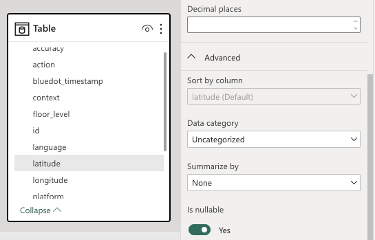
Preparing the Data
When creating a report, ensure that the latitude, longitude, and floor_level columns are correct in the data model. While viewing the data model, select each of these columns and open their advanced settings. They should all be set to a "Summarize by" value of "None".
To find out how to edit the data model, please refer to the Microsoft documentation on editing data models and follow the instructions there.
Data Fields
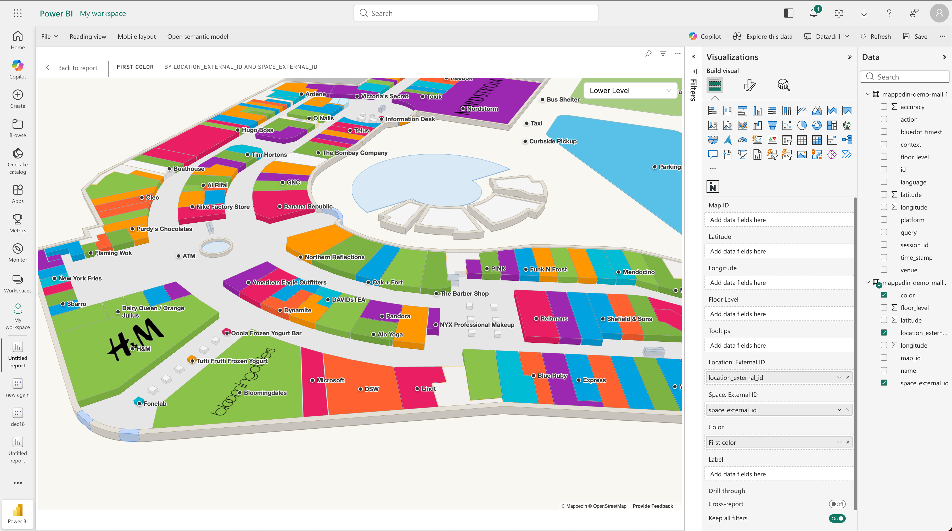
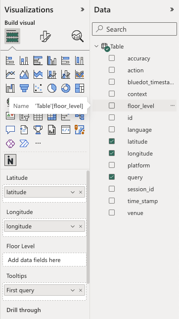
In a Power BI report with analytics data, add the visual to the page. From the "Build visual" menu, supply values into their respective fields.
Coordinate-Based Fields
These fields are used for Scatterplot and Heatmap visualizations:
| Field | Description |
|---|---|
| Latitude | Latitude coordinate for plotting points on the map. |
| Longitude | Longitude coordinate for plotting points on the map. |
| Floor Level | Optional. When provided, data will be filtered by floor level. Use the floor selector on the map to switch between floors. |
Location/Space-Based Fields
These fields are used for Highlight visualization:
| Field | Description |
|---|---|
| Location: External ID | External ID to identify locations for highlighting. Matches against the Location External ID configured in Mappedin CMS. |
| Space: External ID | External ID to identify spaces for highlighting. Matches against the Space External ID from the map geometry. |
Additional Fields
| Field | Description |
|---|---|
| Map ID | Optional. Overrides the default Map ID configured in settings. Use with slicers to enable dynamic map switching between multiple venues. |
| Tooltips | Optional. Up to 3 measures can be added. Values are displayed when hovering over data points (scatterplot) or highlighted locations/spaces. |
| Color | Optional. Color values for highlighted spaces. Accepts CSS colors (HEX, RGB, RGBA, HSL, named colors) or category text. When category text is provided, colors are automatically assigned and a legend is displayed. Requires Location: External ID or Space: External ID. |
| Label | Optional. Custom label text to display for each location/space. When bound, overrides the Label Display setting. Requires Location: External ID or Space: External ID. |
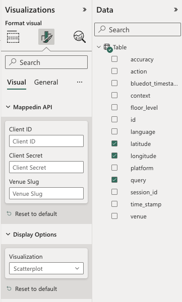
API Configuration
The map needs Mappedin API credentials to fetch the indoor geometry. From the "Format visual" menu, expand the Mappedin API section and enter:
| Setting | Description |
|---|---|
| Client ID | Your Mappedin API Client ID. |
| Client Secret | Your Mappedin API Client Secret. |
| Default Map ID | The Map ID for your venue. Can be overridden by binding a Map ID column in the data fields. |
These keys must have authorization for GeoJSON Export. Contact a Mappedin representative for details on how to obtain these.
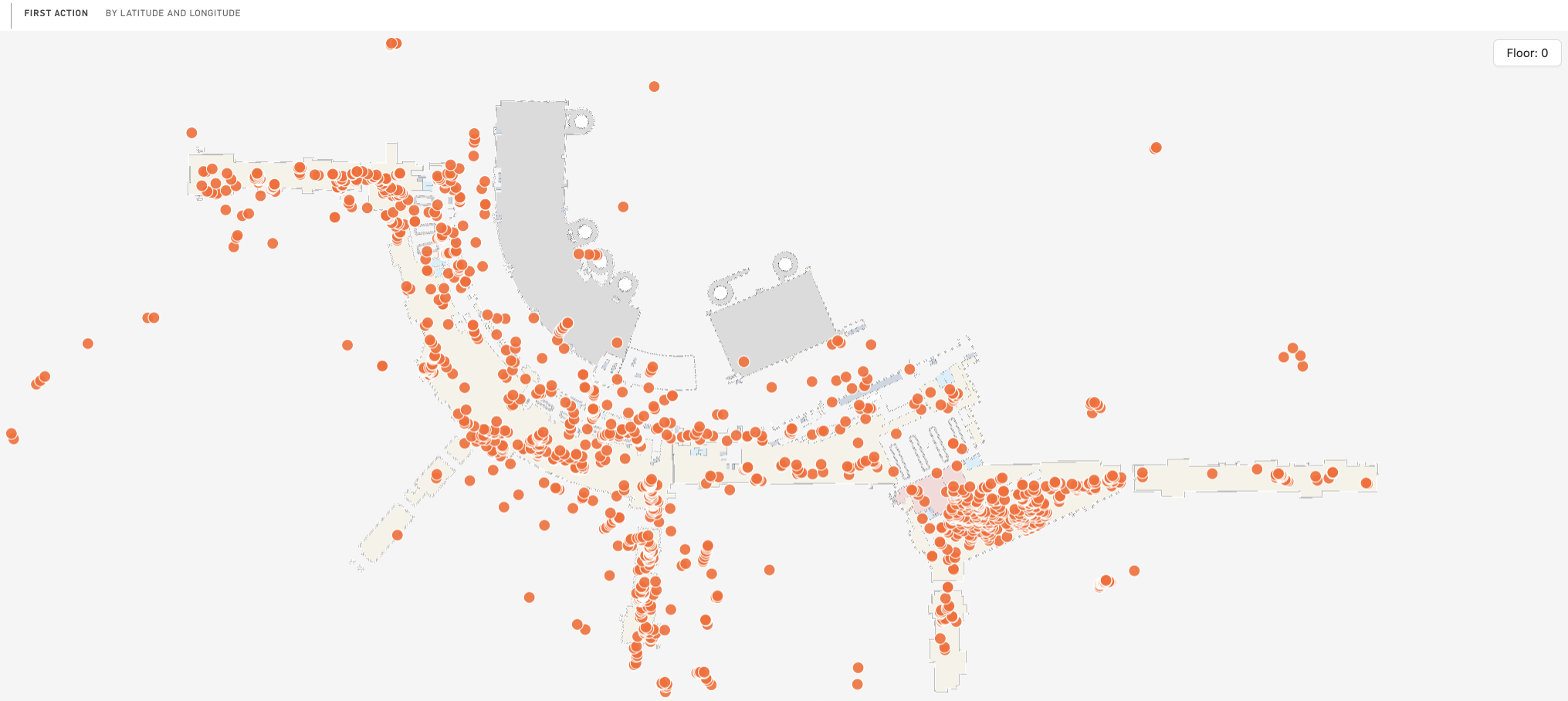
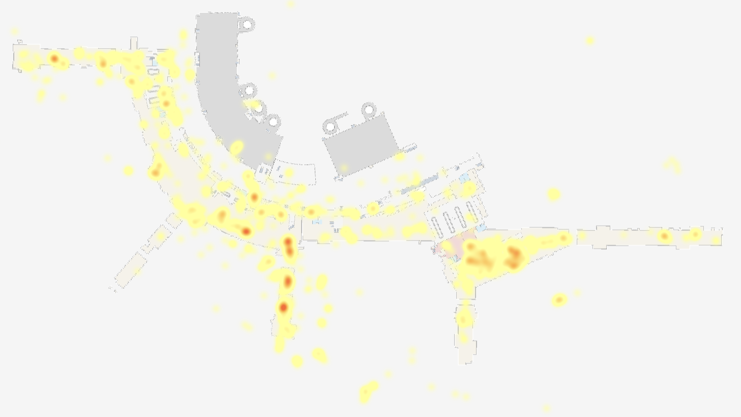
Visualization Types
The visual supports three visualization types, selectable from the Display Options section:
Scatterplot
Displays individual data points on the map. Best for showing discrete events or positions.
Settings:
- Fill Color - Color of the points
- Line Color - Border color around points
- Line Width - Border thickness (in pixels or meters)
- Opacity - Transparency of points (0-100%)
- Radius - Size of points (in pixels or meters)
Heatmap
Displays data density using color gradients. Best for showing concentration of events or traffic patterns.
Settings:
- Minimum Color - Color for lowest density areas
- Middle Color - Color for medium density areas
- Maximum Color - Color for highest density areas
- Intensity - Strength of the heatmap effect
- Opacity - Transparency of the heatmap (0-100%)
- Radius - Spread of each data point's influence (in pixels)
Highlight
Highlights specific locations or spaces on the map based on External IDs. Best for showing performance by location or categorizing spaces.
Settings:
- Color - Default highlight color (can be overridden by the Color data field)
Requirements:
- Requires Location: External ID or Space: External ID to be bound
- External IDs must match those configured in Mappedin CMS
Display Options
General display settings available in the Display Options section:
| Setting | Description |
|---|---|
| Initial Zoom | Starting zoom level (0-20 in Web Mercator units) |
| Flatten Percentage | Flatten the 3D map geometry (0-100%) |
| Visualization | Choose between Scatterplot, Heatmap, or Highlight |
| Background Color | Color behind the map |
| Show Labels | Toggle location labels on the map |
| Label Display | Choose label content: Location Name, Location External ID, or Space External ID |
Data-Driven Colors
The Color data field supports dynamic coloring for the Highlight visualization. You can provide:
CSS Color Values
Provide valid CSS colors directly in your data:
- Hex codes:
#FF6230,#FF623080 - RGB/RGBA:
rgb(255, 98, 48),rgba(255, 98, 48, 0.5) - HSL/HSLA:
hsl(14, 100%, 59%) - Named colors:
red,coral,steelblue
Category Text
When the Color field contains text values that are not valid CSS colors (such as category names like "Retail", "Food & Beverage", "Entertainment"), the visual automatically:
- Assigns a unique color to each category
- Displays a color legend in the bottom-right corner of the map
This is useful for visualizing location categories, tenant types, or any other categorical data.
Using DAX Measures
Create dynamic colors using DAX expressions:
Parameter-based coloring:
ColorByYear =
IF(
    [Year] = SelectedYear,
    "#FF6230",
    "#CCCCCC"
)
Conditional coloring based on metrics:
ColorByPerformance =
SWITCH(
    TRUE(),
    [Sales] > 100000, "#4CAF50",
    [Sales] > 50000, "#FFC107",
    "#F44336"
)
Category-based coloring:
ColorByCategory =
SWITCH(
    [ShopType],
    "Retail", "#2196F3",
    "Food", "#FF9800",
    "Entertainment", "#9C27B0",
    "#757575"
)
Color Priority
When multiple color sources are available, they are applied in this order:
- Color data field (highest priority)
- Conditional formatting rules (if configured in the format pane)
- Default color from Highlight settings
Dynamic Map Switching
Use the Map ID data field with slicers to switch between multiple venues:
- Add a Map ID column to your data that contains the venue's Map ID
- Bind this column to the Map ID field
- Add a slicer connected to the Map ID column
- When users select a different Map ID in the slicer, the visual loads the corresponding venue
Note: Only one Map ID can be active at a time. If multiple Map IDs are present in the filtered data, an error message will be displayed prompting users to filter to a single Map ID.
Tips and Best Practices
- Data limits: The visual supports up to 30,000 data points per query
- Floor filtering: When Floor Level is bound, use the floor selector overlay on the map to navigate between floors
- Tooltips: Add meaningful measures to the Tooltips field to provide context when users hover over data points
- Labels: Use the Label field to display custom text (like sales figures or status) directly on the map
- Performance: For large datasets, consider using aggregated data or filtering to specific time ranges